We released our second set a while ago and also wanted to offer printed cards to our fans—only for the production cost of the cards, of course. However, our approach to adjusting the files for printing had some flaws, which resulted in cards that were cut off. Read on to find out what we had to change, what to expect next, and what this means for your cards.
How it all Started
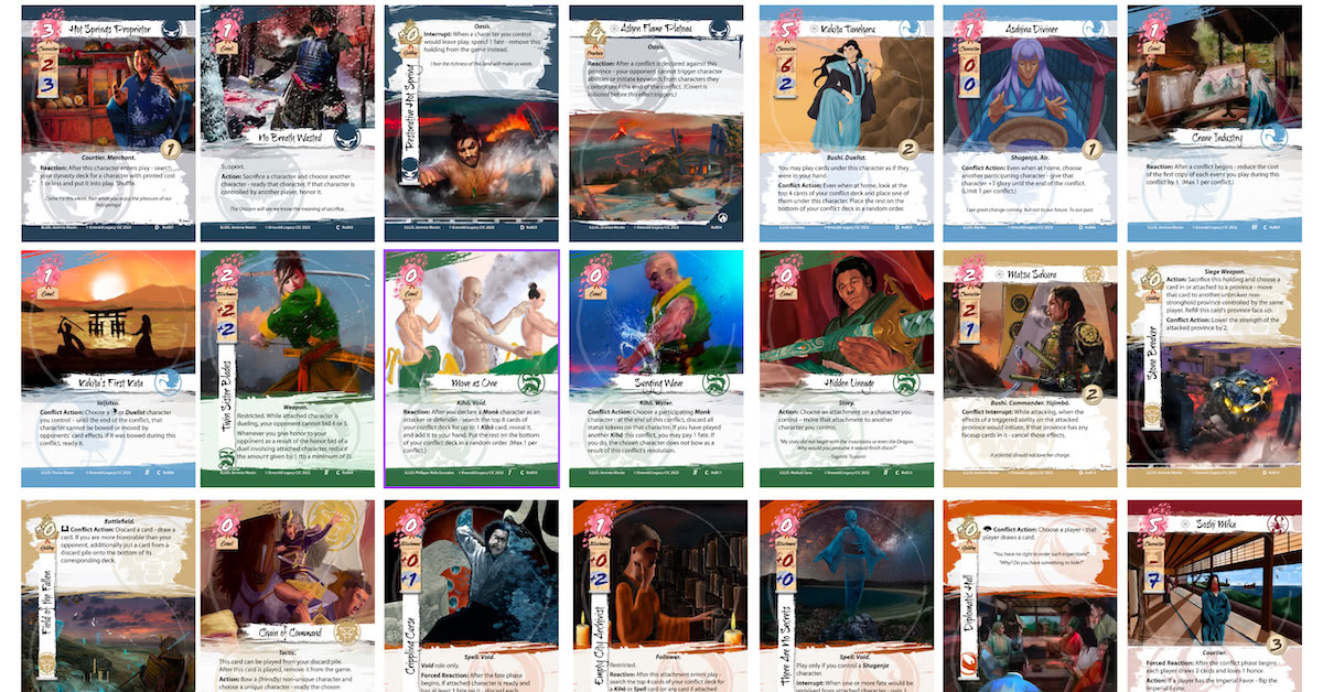
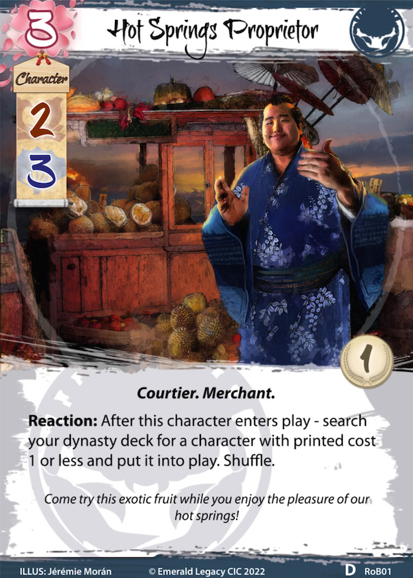
When we started with the design of the frames for the cards, we mainly thought of the digital representation, ignoring printing at the beginning. However, when Through the Mists was released, we also wanted to provide a possibility to get them printed on paper. This posed a challenge. When we tested our cards with a print service, we quickly found out that parts of the cards would be cut off–we needed an additional bleed frame. (All card images will be from Restoration of Balance, as Through the Mists is not completely redesigned yet.)
Bleed to the Rescue
We had two options: redesign all our frames and cards, or find another way to add bleed frames. We wanted to provide the cards quickly, so redesigning was out of the question, especially since the original designer had left the project temporarily. Using AI to “magically” create bleed frames was also too much effort, as we would have to do this for each single card. We came up with a simple yet (back then) perfect solution: mirror the card to each of its sides with our layout tool, to quickly (within seconds!) create the required bleed frame. Here’s a quick look at the digital version of the card and the one with bleed frame:
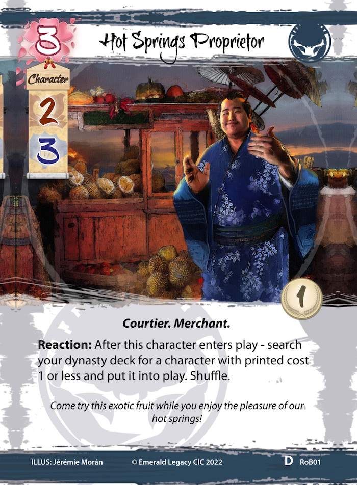
Awesome! We had our bleed frame, we sent it to a printing service (Europe), and the results for Through the Mists were pretty good. Then we used different services…
Flaws in the Design
When we received our test packs from the printing services in the UK and the US, we had several issues with the cards (which we knew that they might happen). The text at the bottom (illustrator, copyright, etc.) was cut off in half, the sakura at the top was cut off so that it looked ugly, parts of the mirroring were too apparent, etc. Why is that? Well, let me show you above bleed image with some guidelines.
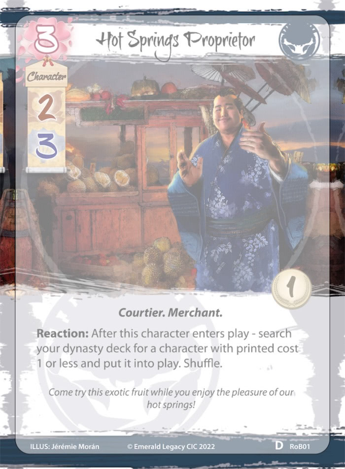
So when you look at it, you can see that the bleed border is exactly as it should be, and our resulting card contains all elements—albeit only just. Unfortunately, the cutting machines do not work as precisely as we would like them to. If the paper sheet is misplaced by a few millimetres or if the machine is not perfectly configured, the resulting card will be shifted by that amount. So the text at the bottom can be cut off, you might see the mirrored frame at the top (have a closer look at the bleed image above without the template overlay. Do you notice that the sakura pedals are cut off?), and have an overall unsatisfactory result. One of the companies reminded us of the “safe zone” that is also within their templates. Ok, let’s look at the safe zone of our card.
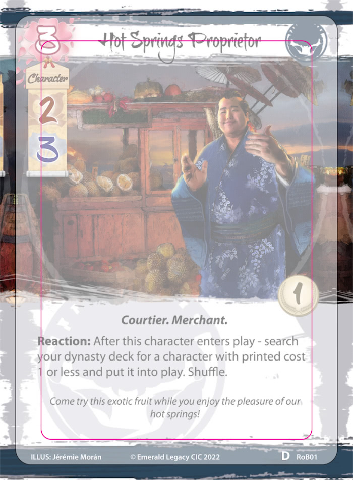
Snap! There’s not much left of our card. Of course, they will most likely never produce cards that are cut off at one of the pink lines. But they will not accept complaints if we place elements outside of that area which are then cut off.
We thought about simply increasing the mirrored area, but that would reduce the actual card and text even more, and create an awkward result in most of the cases. So what to do now?
Going Back to the Drawing Board
Since our graphics lead had left the project with the release of RoB, I considered it my job to right this wrong. I found out that another tool I had was able to deal with photoshop files, so I started to redesign the card frames at first.
One of the cool features of the tool was the fact that I was able to add a bleed area by default, which was exported with the card frames. Great! I moved elements around so that they are closer to/within the safe zone. I added all the details of the sakura to the export (the printing machine will cut them off at some point any way).
To improve the readability of the text at the bottom, I decided to remove a lot of the “noise” that was happening there. By doing so, I was also able to remove the difference in colour that, for example, characters and events of one clan had. This had bugged me since Through the Mists, to be honest. 😉
Some card templates of some clans also had different brush effects, which I also correct, so that they only are different in colour and clan mon. The noise reduction at the bottom also happened at the top of most templates, so that they are more unified and look more solid. But enough words, let me show you the new card.
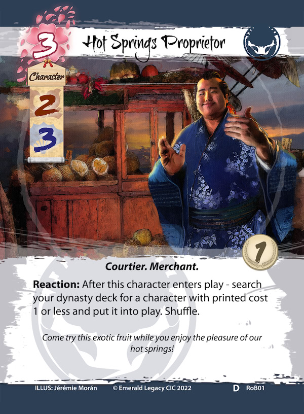
What’s this, a new font? Yes, indeed. You’re looking at the font “Flood”. When we announced that we were redesigning the frames, we were asked if we can also change the font in the process. Some numbers (looking at you, 6!) looked a bit too much like different numbers (in the case of 6, it looked like a 0). This was especially difficult when playing online, as the cards are a lot smaller there. I also used this opportunity to remove the white outline of military and political strength. It doesn’t look good with that font and also isn’t necessary, to my mind.
We hope you like all the changes that we make, please let us know your feedback on discord!
What is Next?
We’re currently waiting eagerly for our test prints from DriveThruCards, Azao Games and Ivory Graphics UK. Once we have them and are happy with the result, we can offer them to you. You will be able to directly purchase them from DriveThruCards (mainly for our American players, but they deliver anywhere in the world). If you’re in Europe or the UK and also want a pack (or more!), please contact me on discord, as we’re doing a big order for those two regions to get an even better price. We will only charge you what it costs to print the cards (and shipping), we will not earn money with the cards. You can, of course, also just grab the files from our website (for free), print them yourself or approach a printing company of your choice!
I need to recover I bit, and then I will redesign Through the Mists, too. To me, consistency in looks is important, and I definitely want another copy of the set with the new design.
An important note: All cards that have already been printed are still valid of course! Local play is not that big at the moment, but with what we have planned for next year, you can always participate with the old or new design, it doesn’t matter. The difference isn’t that big anyway.
We know that this might make some of you unhappy, but we rather do this now than after the next set.